D3.js is a very popular graph library to help developers draw various kind of charts using JavaScript in a webpage. It utilizes the SVG format supported by all major modern browsers and can help developers get rid of the old age of Flash or server side graph drawing libraries.
In this post, we will introduce some simple examples of drawing bar chart with labels using D3.js.
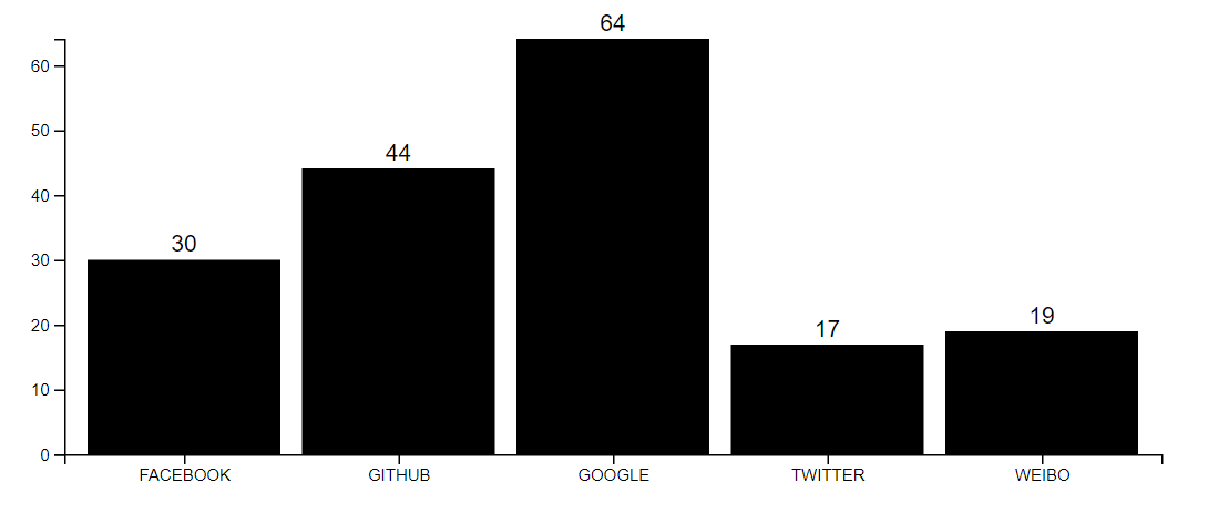
First, let's see what will be the final look of the graph drawn.
Below is the complete source code for this example.
let data = {
    "FACEBOOK": 30,
    "GITHUB"  : 44,
    "GOOGLE"  : 64,
    "TWITTER" : 17,
    "WEIBO"   : 19
};
let margin = {top: 20, right: 20, bottom: 30, left: 40};
let svgWidth = 720, svgHeight = 300;
let height = svgHeight- margin.top- margin.bottom, width = svgWidth - margin.left - margin.right;
let sourceNames = [], sourceCount = [];

let x = d3.scaleBand().rangeRound([0, width]).padding(0.1),
    y = d3.scaleLinear().rangeRound([height, 0]);
for(let key in data){
    if(data.hasOwnProperty(key)){
        sourceNames.push(key);
        sourceCount.push(parseInt(data[key]));
    }
}
x.domain(sourceNames);
y.domain([0, d3.max(sourceCount, function(d) { return d; })]);

let svg = d3.select("#account_group").append("svg");
svg.attr('height', svgHeight)
    .attr('width', svgWidth);

svg = svg.append("g")
         .attr("transform", "translate(" + margin.left + "," + margin.top + ")");

svg.append("g")
    .attr("class", "axis axis--x")
    .attr("transform", "translate(0," + height + ")")
    .call(d3.axisBottom(x));

svg.append("g")
    .attr("class", "axis axis--y")
    .call(d3.axisLeft(y).ticks(5))
    ;

// Create rectangles
let bars = svg.selectAll('.bar')
    .data(sourceNames)
    .enter()
    .append("g");

bars.append('rect')
    .attr('class', 'bar')
    .attr("x", function(d) { return x(d); })
    .attr("y", function(d) { return y(data[d]); })
    .attr("width", x.bandwidth())
    .attr("height", function(d) { return height - y(data[d]); });

bars.append("text")
    .text(function(d) {
        return data[d];
    })
    .attr("x", function(d){
        return x(d) + x.bandwidth()/2;
    })
    .attr("y", function(d){
        return y(data[d]) - 5;
    })
    .attr("font-family" , "sans-serif")
    .attr("font-size" , "14px")
    .attr("fill" , "black")
    .attr("text-anchor", "middle");
The data set is actually an key-value map. And the keys will be used as the bottom labels and values will be the actual value labels on top of the bar.
The first step is to create the x scale which is a scaleBand as we are creating a bar chart and y scale which is a linear scale as it will reflects the actual linear values of each key. The scales are mainly used for transforming data values to visual variables such as position, length and colour. The domains for each scale are calculated dynamically, for x scale, the range bound is 0 to the width of the SVG, for y scale, the range bound is 0 to the max value of the data set value.
Next, a SVG component is created and appended to the DIV component with id account_group. Followed by setting up the coordinate systems with different labels and values.
The final thing is to draw the actual bar and the corresponding value of each value on top of the bar. The bar is a rect component and the value is a text component and they are wrapped in a g component. The position of the bar and value are calculated using the two key scale function x and y. They are in charge of how the position is scaled so that each component is in the correct position.
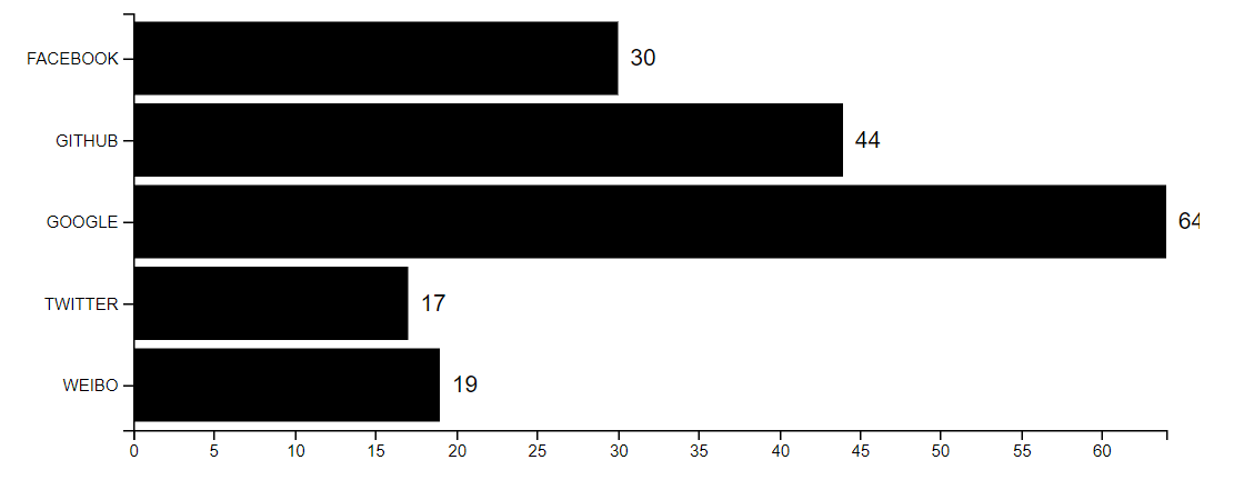
Below is am example of horizontal bar chart with same data.
The corresponding source code can be found below.
let data = {
    "FACEBOOK": 30,
    "GITHUB"  : 44,
    "GOOGLE"  : 64,
    "TWITTER" : 17,
    "WEIBO"   : 19
};
let margin = {top: 20, right: 20, bottom: 30, left: 80};
let svgWidth = 720, svgHeight = 300;
let height = svgHeight- margin.top- margin.bottom, width = svgWidth - margin.left - margin.right;
let sourceNames = [], sourceCount = [];

let x = d3.scaleLinear().rangeRound([0, width]),
    y = d3.scaleBand().rangeRound([0, height]).padding(0.1);
for(let key in data){
    if(data.hasOwnProperty(key)){
        sourceNames.push(key);
        sourceCount.push(parseInt(data[key]));
    }
}
x.domain([0, d3.max(sourceCount, function(d) { return d; })]);
y.domain(sourceNames);

let svg = d3.select("#account_group").append("svg");
svg.attr('height', svgHeight)
   .attr('width', svgWidth);

svg = svg.append("g")
         .attr("transform", "translate(" + margin.left + "," + margin.top + ")");

svg.append("g")
    .attr("transform", "translate(0, " + height + ")")
    .call(d3.axisBottom(x))
    ;

svg.append("g")
    .call(d3.axisLeft(y))
    ;

// Create rectangles
let bars = svg.selectAll('.bar')
    .data(sourceNames)
    .enter()
    .append("g");

bars.append('rect')
    .attr('class', 'bar')
    .attr("x", function(d) { return 0; })
    .attr("y", function(d) { return y(d); })
    .attr("width", function(d){return x(data[d])})
    .attr("height", function(d) { return y.bandwidth(); });

bars.append("text")
    .text(function(d) {
        return data[d];
    })
    .attr("x", function(d){
        return x(data[d]) + 15;
    })
    .attr("y", function(d){
        console.log(d);
        return y(d) + y.bandwidth() * (0.5 + 0.1); // here 0.1 is the padding scale
    })
    .attr("font-family" , "sans-serif")
    .attr("font-size" , "14px")
    .attr("fill" , "black")
    .attr("text-anchor", "middle");