
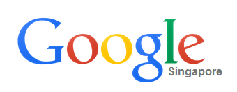
Google today changed their logo, the new logo adopts the flat design with a lighter color scheme. Apart from these, there are no major changes on the font style, character color etc.
Old logo

New logo
Along with the new logo, Google also released a new navigation menu that sits next to the Share and account info. The launcher, which looks just like the app launcher on Chrome OS, brings up an App grid with your favorite Google services.
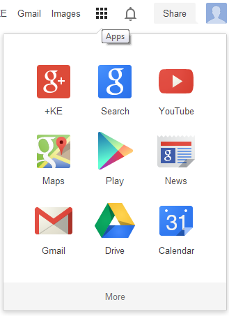
Actually, Google wanted to replace the top black navigation bar back in 2011. But they just did some small scale testings for the new change until recently.

No comment for this article.