CSS's :has is a pseudo-class representing an element if any of the selectors passed as parameters matching at least one element. From the name, it's also easy to understand how it matches elements.
The syntax is pretty easy as well:
:has([some-selector])With this pseudo class, it can do lots of things which previously would be challenging or need tweaking the DOM elements with JavaScript. This post will demonstrate what :has can be used for.
Introduction
Below are a few simple examples on how it works.
If wanna select all children with img in element a, can have
a:has(> img)If wanna select all h1 elements followed by element p, can have
h1:has(+ p)As for browser support, currently Chrome 101+(with experiment feature turned on or waiting for Chrome 105+), Safari 15.4+ or Firefox(with experiment feature turned on) have support for this new pseudo class.
Real World Examples
Required Fields in Form
Below is a form which have some required fields.
<form>
  <item>
    <label>用户名</label>
    <input required>
  </item>
  <item>
    <label>备注</label>
    <input>
  </item>
</form>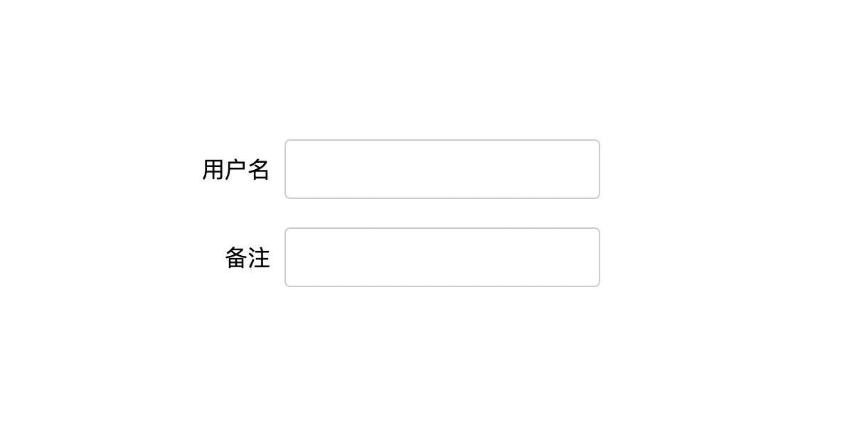
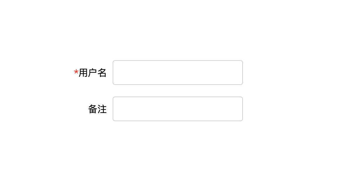
Now can use :has to add * before the field.
label:has(+input:required)::before{
  content: '*';
  color: red;
}
It is easy to understand that it selects all label elements with required attributes for input elements and then puts the content before the labels.
Drag and Drop
Sometimes a list needs to support drag and drop capability, but for user experience, it will only allow a small area to be draggable.
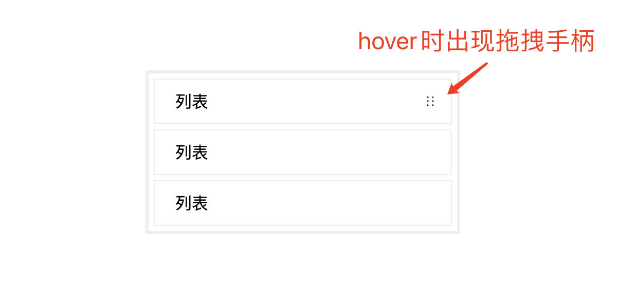
The HTML would be like
<div class="content">
  <div class="item">列表<span class="thumb"></span></div>
  <div class="item">列表<span class="thumb"></span></div>
  <div class="item">列表<span class="thumb"></span></div>
</div>
If wanna see the drag handle when hovering and drag when pressing, :has can be added. The key CSS code would look like
.thumb{
  /**/
  opacity: 0
}
.item:hover .thumb{
    opacity: 1;
}
.item:has(.thumb:hover){
    -webkit-user-drag: element;
}
Multi-layer Hover
Assume there are divs inside divs, and if wanna add hovering feature only for the inner divs, may need complex CSS definitions without :has.
<div class="box-1">
  <div class="box-2">
    <div class="box-3"></div>
  </div>
</div>
The CSS looks like
div:hover{
  outline:4px dashed rebeccapurple
}
The effect looks like
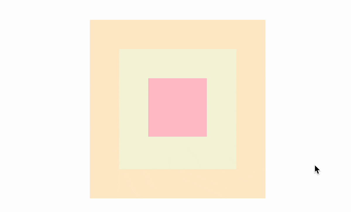
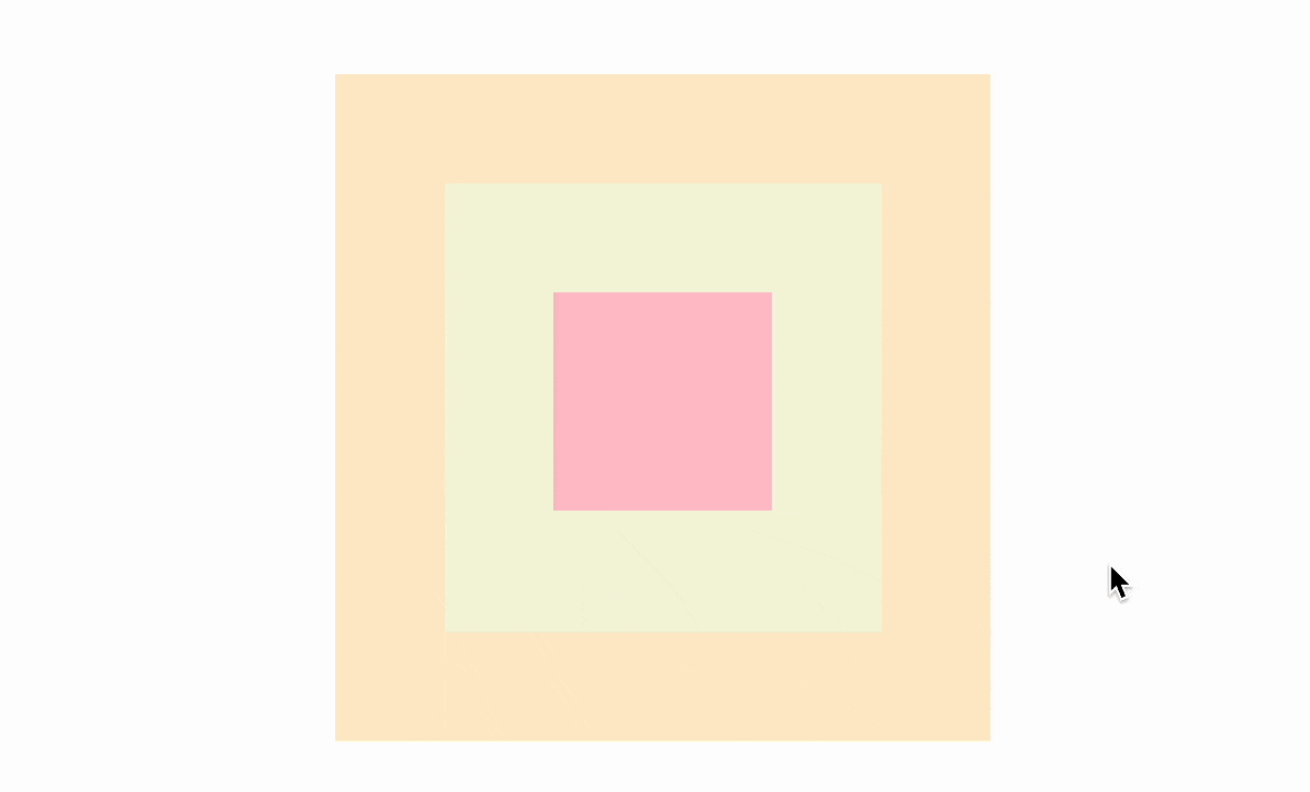
When hovering over the most inner element, the outer elements also trigger hovering effect, it's like bubbling. How to only trigger hovering effect for the selected element? i.e. exclude parent elements. Yes, can use ;has now.
div:not(:has(:hover)):hover{
  outline:4px dashed rebeccapurple
}
div:hash(:hover) will select all elements having child element in hover state, hence when hovering over box-3, div:has(:hover) will select the two parent elements except box-3, thereafter with :not it will reverse the selection and only selects box-3.
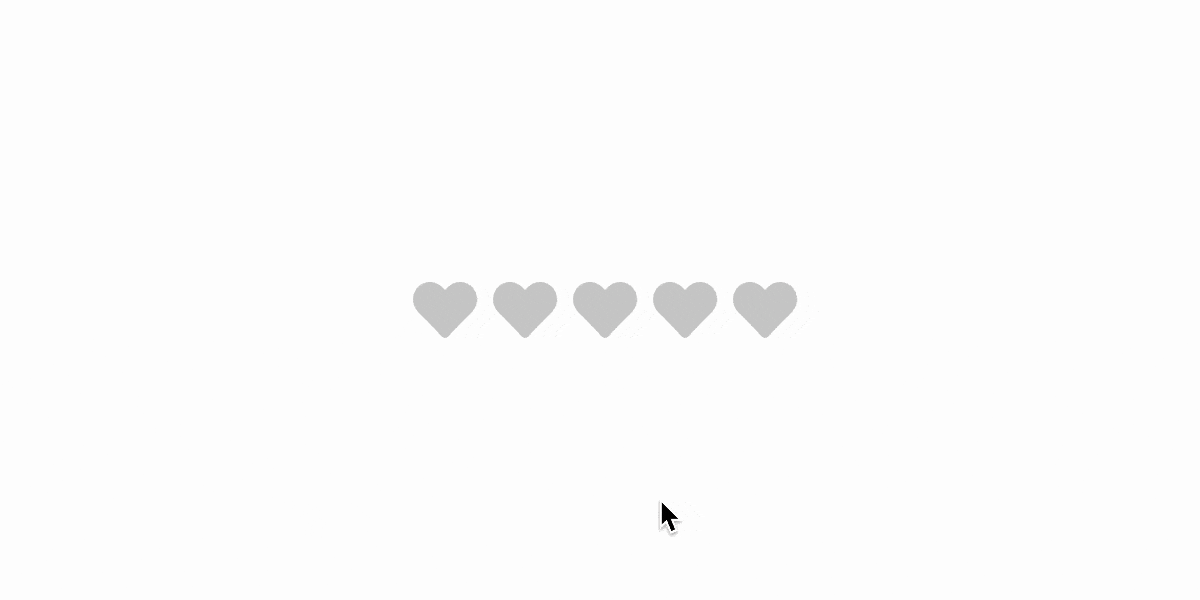
Rating
For rating component, :has can also be useful
<star>
  <input name="star" type="radio">
  <input name="star" type="radio">
  <input name="star" type="radio">
  <input name="star" type="radio">
  <input name="star" type="radio">
</star>
The CSS looks like
star{
  display: flex;
}
star [type="radio"]{
  appearance: none;
  width: 40px;
  height: 40px;
  margin: 0;
  cursor: pointer;
  background: #ccc;
  transition: .3s;
  -webkit-mask: url("data:image/svg+xml,%3Csvg xmlns='http://www.w3.org/2000/svg' viewBox='0 0 512 512'%3E %3Cpath d='M462.3 62.6C407.5 15.9 326 24.3 275.7 76.2L256 96.5l-19.7-20.3C186.1 24.3 104.5 15.9 49.7 62.6c-62.8 53.6-66.1 149.8-9.9 207.9l193.5 199.8c12.5 12.9 32.8 12.9 45.3 0l193.5-199.8c56.3-58.1 53-154.3-9.8-207.9z'%3E%3C/path%3E %3C/svg%3E") center / 80% no-repeat;
}
The effect looks like

If wanna select the current hovered or checked star and its previous stars, there needs some tricky work done before using :has. With ;has, can achieve this effect easily.
star [type="radio"]:hover,
star [type="radio"]:has(~:hover),
star:not(:hover) [type="radio"]:checked,
star:not(:hover) [type="radio"]:has(~:checked){
  background: orangered;
}
The effect looks like
Date Range Picker
It is a headache to build the date range picker function even with JavaScript, but with :has, it becomes a breeze.
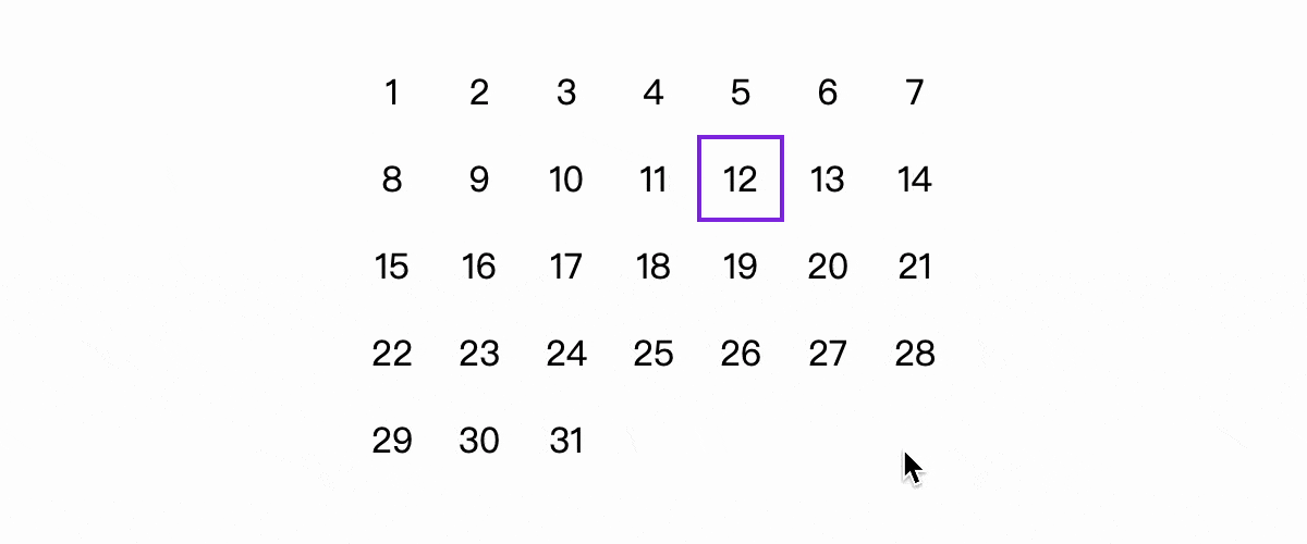
Assuming the HTML code looks like
<div class="date">
  <span>1</span>
  <span>2</span>
  <span>3</span>
  ...
  <span>30</span>
  <span>31</span>
</div>
It consists of two features: hovering and selection
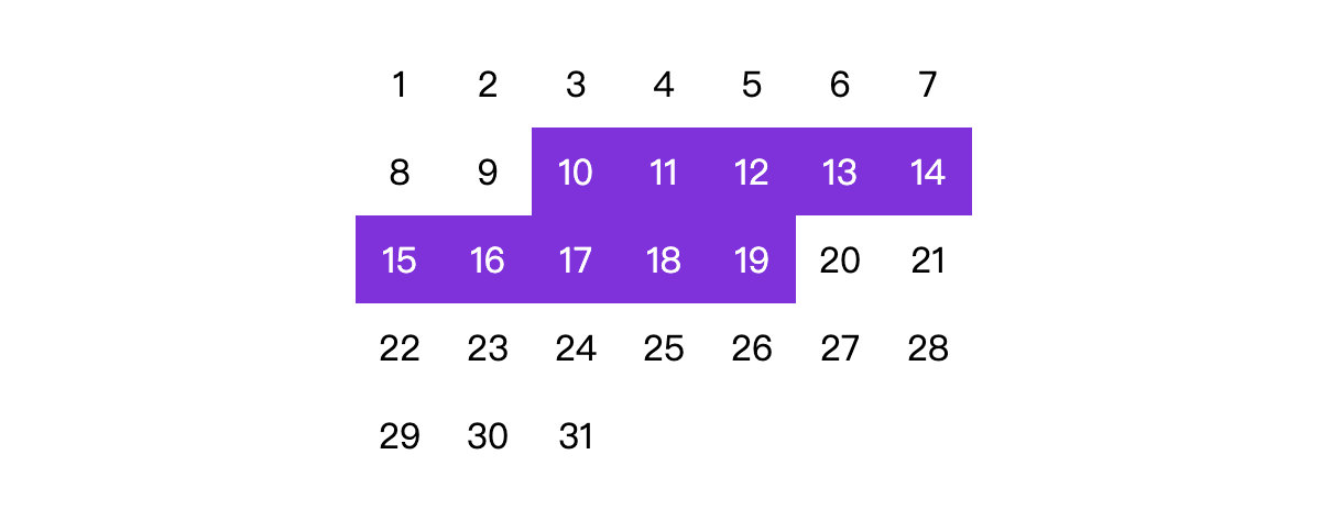
First looking at the selection function, when two elements are selected, all the elements between these two also need to be selected.
<div class="date">
  <span>1</span>
  <span>2</span>
  <span class="select">3</span>
  ...
  <span class="select">30</span>
  <span>31</span>
</div>
Below CSS code can be used to select all these elements
.select,
.select~span:has(~.select){
   background-color: blueviolet;
   color: #fff;
}
The effect looks like
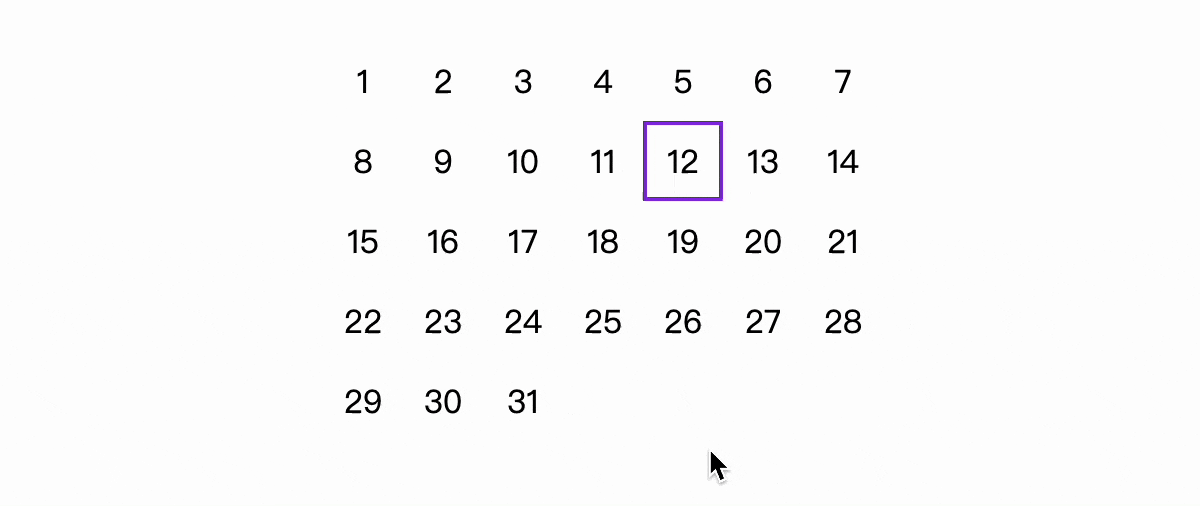
For the hovering effect, assuming one element is selected.
<div class="date">
  <span>1</span>
  <span>2</span>
  <span class="select">3</span>
  ...
  <span>30</span>
  <span>31</span>
</div>
Now it needs to select all elements between the selected element and the element the mouse is hovering over. It has two different cases: 1. the mouse is before the selected element, 2. the mouse is after the selected element.
span:hover~span:has(~.select),
.select~span:has(~:hover)
{
  background-color: blueviolet;
  color: #fff;
}
The effect looks like
There is another issue, there is a need to differentiate the cases where only one element is selected or two elements are selected. If two elements are selected, the hovering should not take effect. Below CSS can be used.
.date:not(:has(.select~.select)){
}
This will select element with .select after the element with .select which means there are at least two elements with .select.
.date:not(:has(.select~.select)) .select,
.date:not(:has(.select~.select)) span:hover{
  background-color: transparent;
  color: inherit;
  outline: 2px solid blueviolet;
  outline-offset: -2px;
}

.date:not(:has(.select~.select)) span:hover~span:has(~.select),
.date:not(:has(.select~.select)) .select~span:has(~:hover)
{
  background-color: blueviolet;
  color: #fff;
}
The element selection is still handled with JavaScript, but now JavaScript is just for selection, not for any visual changing.
date.addEventListener('click', ev => {
  const current = date.querySelectorAll('.select');
  if (current.length == 2) {
    current.forEach(el => {
      el.classList.remove('select')
    })
  }
  ev.target.classList.add('select')
})
The final effect looks like

Conclusion
:has is really a powerful feature added to CSS and can be used for solving issues which previously need lots of code. What are other real-world scenarios you can think of for using ;has?
Reference: CSS 有了:has伪类可以做些什么? - SegmentFault 思否