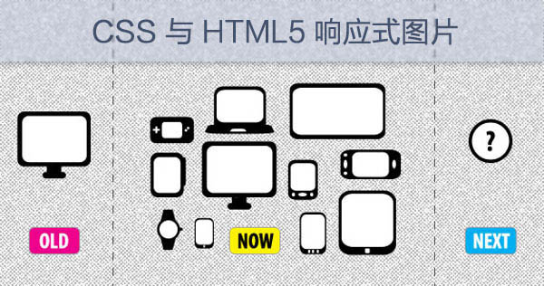
With the popularity of Retina screen, the requirement of the images in the webpages is higher. How to make sure the image still clear while enlarging twice on retina screen? This brings much trouble to web developers, the good news is CSS3 and HTML5 is trying to change this, we can use response image.
What is responsive image?
It means user agent loads different images according to different resolutions of output devices, it will not waste bandwidth as well. In addition, it can load respective images when the resolution of the device changes.

CSS responsive image
iOS developers should be familiar with this technique. To adapt to Retina screen, the traditional CSS3 implementation method is to load an image with width and height twice as the original width and height. Then using Media Queries to make the background image smaller(background-size:50% 50%;). For example:
.mod .hd h3 { background-image:url(http://img02.taobaocdn.com/tps/i2/T10s3JXn4XXXXnbIAn-105-160.png );/* General screen */
/* ------------ Retina ------------ */
@media only screen and (-o-min-device-pixel-ratio: 2/1), /* Opera */
only screen and (min--moz-device-pixel-ratio: 2), /* Prior to Firefox 16 */
only screen and (-webkit-min-device-pixel-ratio: 2), /* Webkit */
only screen and (min-resolution: 240dpi), /* Standard */
only screen and (min-resolution: 2dppx) /* Standard */
{
.mod .hd h3{
background-image:url(http://img02.taobaocdn.com/tps/i2/T1t9wzXlxXXXczY8cm-212-310.png);
background-size: 106px 155px;
}
}
The effects are:
We need to take note when creating @2x images:
For images which are just having text inside like above, don't directly zoom the image, this will make the image lose integrity, this is the problem of PhotoShop rendering, you should adjust the font size.
There is a resolution property in CSS Media Queries to define the resolution, there are two more properties: min-resolution and max-resolution. In addition, CSS image level 3 image-resolution adds some new units such as dppx, the support of it in different browsers can be found below:
| Properties | Chrome | Firefox (Gecko) | IE | Opera | Safari (WebKit) |
|---|---|---|---|---|---|
| Standard property | No[1]「4〠| 3.5 (1.9.1) [2] | 9 | 9.5 | No [1]「4〠|
dppx |
「4〠| 16.0 | Unknown | 12.10「3〠| 「4〠|
[1]. Chrome supports -webkit-min-device-pixel-ratio and -webkit-max-device-pixel-ratio
[2]. Firefox prior to 8.0 only accepts integers without units, starting from 16 it supports dppx
[3]. Change our implementation of the resolution media query to use CSS units。
[4]. David Barr implemented CSS image-resolution in Webkit and it supports dppx,dpi and dpcm.
Also please note:
1. The value of -o-min-device-pixel-ratio should be a ratio such as 2/3,4/5. Demo : http://dev.opera.com/articles/view/an-introduction-to-meta-viewport-and-viewport/
2. Prior to Firefox 16, min--moz-device-pixel-ratio has two - after min.
3. 1dppx is equal to 96 dpi
Obviously, it's still troublesome to implement responsive image using Media Queries, it's not easy to maintain CSS codes and also it introduces some hacks. We expect some built in syntax to load different images accordingly, the lucky thing is CSS image level 4 has included this syntax called image-set.
= image-set( [ , ]* [ | ] ) = [ | ]
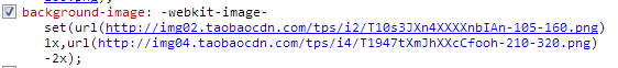
The above example can be rewritten as :
background-image:url(http://img02.taobaocdn.com/tps/i2/T10s3JXn4XXXXnbIAn-105-160.png);/* General screen */
background-image: -webkit-image-set(
url(http://img02.taobaocdn.com/tps/i2/T10s3JXn4XXXXnbIAn-105-160.png) 1x,
url(http://img04.taobaocdn.com/tps/i4/T1947tXmJhXXcCfooh-210-320.png) 2x);/* Retina */
The unit x here equals to dppx, it needs further discussion whether they should be standardized. Now Webkit only implements the url() format, it doesn't support color,*-gradient().
Below are the values of min-device-pixel-ratio in some common mobile devices:
-webkit-min-device-pixel-ratio: 1.0
- All non Retina Mac
- All non Retina iOS devices
- Acer Iconia A500
- Samsung Galaxy Tab 10.1
- Samsung Galaxy S
- Other devices
-webkit-min-device-pixel-ratio: 1.3
- Google Nexus 7
-webkit-min-device-pixel-ratio: 1.5
- Google Nexus S
- Samsung Galaxy S II
- HTC Desire
- HTC Incredible S
- HTC Velocity
- HTC Sensation
-webkit-min-device-pixel-ratio: 2.0
- iPhone 4
- iPhone 4S
- iPhone 5
- iPad (3rd generation)
- iPad 4
- All Retina displays Mac
- Google Galaxy Nexus
- Google Nexus 4
- Google Nexus 10
- Samsung Galaxy S III
- Samsung Galaxy Note II
- Sony Xperia S
- HTC One X
HTML5 responsive images
CSS image-set solves the responsive issue of background image, but how about the img element in HTML? In November 2011, @brucel proposed a draft of HTML5:
<picture alt="">
<source src=hires.png media="min-width:800px">
<source src=midres.png media="min-width:480px">
<source src=lores.png>
<!-- For browsers which don't support above -->
<img src=midres.png alt="">
</picture>
At the same time, other ideas are coming out, then the W3C discussion group Responsive Images Community Group was born. The latest standard can be found here : http://picture.responsiveimages.org/ . The latest update is 7th January, 2013 before this article release. The example in the standard is:
<picture width="500" height="500">
<source media="(min-width: 45em)" srcset="large-1.jpg 1x, large-2.jpg 2x">
<source media="(min-width: 18em)" srcset="med-1.jpg 1x, med-2.jpg 2x">
<source srcset="small-1.jpg 1x, small-2.jpg 2x">
<img src="small-1.jpg" alt="">
<p>Accessible text</p>
</picture>
We can find srcset here is similar to image-set, usually the resource in srcset has fallback feature, i.e, if the first image cannot be loaded, then the following image will be loaded. But Apple's eoconnorproposed another method:
<img src="foo-lores.jpg" srcset="foo-hires.jpg 2x,
foo-superduperhires.jpg 6.5x"
alt="decent alt text for foo.">
The draft of responsive image in HTML5 just begins, but its prospect is bright. Now what we can do is to use image-set in CSS since the major browsers on retina screen devices are based on Webkit. We can also use Media Queries if necessary.
